Does the name Clippy ring a bell? He was Microsoft’s attempt at leading user guidance back in the 1990s. Since then, he’s been named the world’s most hated virtual assistant by some.
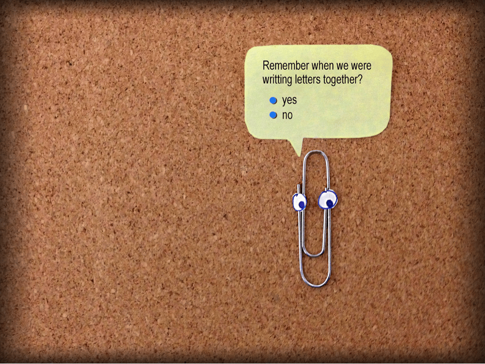
This bouncing little paper clip would often appear on your screen just as you were about to get your momentum to write. Although the intent was to guide people into honing their word processing abilities, Clippy’s knack for appearing at the most inconvenient times felt intrusive at best.
And so, Clippy disappeared. Since then, we’ve made serious attempts to leapfrog away from interruption-based approaches to user guidance on pages and products. The problem is, though, the more things change, the more they stay the same. Have we really made it that far from a Clippy style approach to guidance? Some would argue no. To illustrate the point, let’s take a look at how user guidance has evolved over the years.
From Offline to Online User Guidance
User guidance used to be all about offline user manuals. Thick books were printed and delivered to guide a user through a new platform, program or product. In some cases, these thick books still work, just not in the way some authors intend them to.
In the 1980s, John M. Carroll and Mary Beth Rosson from IBM conducted a study on how people consume user manuals. Even back then they knew something had to give with this approach. Researchers found that users don’t actually read the manuals to learn something new and instead only reference them when a problem arises. This became known as the paradox of the active user.
A motivational paradox arises in the “production bias” people bring to the task of learning and using computing equipment. Their paramount goal is throughput. This is a desirable state of affairs in that it gives users a focus for their activity with a system, and it increases their likelihood of receiving concrete reinforcement from their work. But on the other hand, it reduces their motivation to spend any time just learning about the system, so that when situations appear that could be more effectively handled by new procedures, they are likely to stick with the procedures they already know, regardless of their efficacy.
In light of this, and with the desire to drive user engagement, companies started transitioning away from the traditional user manual. Instead, a salesperson would be sent to sit shoulder-to-shoulder with a prospect or new user to answer questions, set up the product, and showcase the features. That was “real-time” user engagement, and to some extent, face-to-face interaction still works. The problem is, hiring this kind of workforce isn’t scalable, so companies took another step to replicate this feeling by creating a site where a person walks onto the screen.
That’s right! You didn’t have to pay to have someone fly to your city and get you all set up. You had a person right there on your computer screen to walk you through everything you needed to know. We love to laugh at this hodgepodge approach now, but a decade or two ago this is how it was done.
Digital transformation has forced brands to pivot into new areas outside of their expertise. User guidance certainly is one of those areas, with brands clambering to keep up with digital trends . To stay competitive, today’s brands need to make their digital platforms a lot more engaging. And so, like the GPS replaced the road map, digital products are replacing offline manuals. Instead of the need for shoulder-to-shoulder interactions to walk new users through an application or product, be it in person or on screen, there are now plenty of software tools out there that act as guides to support customers on their journey. The challenge is that many of these tools are interruptive, just like Clippy, and don’t facilitate a sublime customer experience.
User Guidance Remains Interruptive
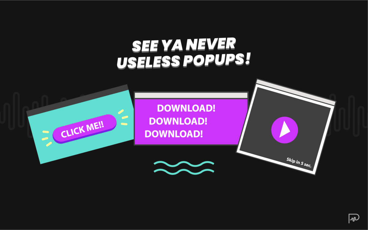
User guidance extends across the funnel, from guiding someone to look at a product they might find valuable to moving a new user through the product. To capture the attention of distracted customers across the journey, we’ve resorted to interruptive approaches. For example, have you ever seen a banner ad that looked something like this?

There are marketers out there that will say anything to get a click. They think they’re doing you a favor because they’re “guiding” you to something that they’ve deemed valuable for you. As attention-grabbing as big, bold colors and arrows might be, this in-your-face approach often feels a little smarmy.
To soften the experience while still getting in front of you, many marketers have switched away from such an aggressive approach and now use other tactics to capture our attention. Again, to do us a favor and be extra sure we didn’t miss something on a page, marketers plant pop-ups over pages to force us to look in their direction.
These pop-ups come in all shapes and sizes. Sometimes a pop-up is a simple box that covers the content you want to read. To exit out of it, you have to answer a question that either leads you elsewhere in your journey or makes you feel guilty for not taking the bait, like this one from AppSumo.
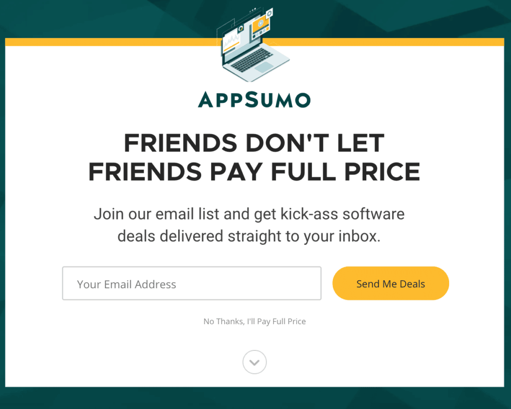
Although playful and fun, the pop-up covers your entire screen, disrupting your experience with the intent to divert you to a new spot rather than the place you’d intended to visit early on. The strategy is obvious, you have to see this or you can’t see anything else, but it’s a nightmare for user experience.
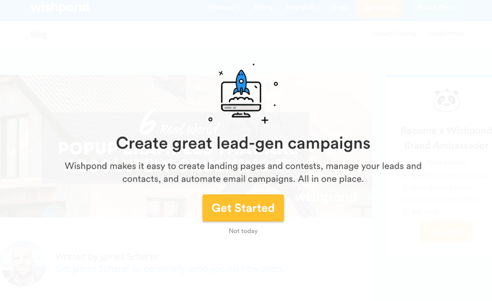
In other cases, marketers wait until you’re leaving to show you a pop-up. This approach is called the exit pop-up, and it’s meant to keep people’s attention who are trying to leave the site. Sure, it might feel a little less intrusive because the person was leaving anyway, but it’s not doing anything to improve the experience overall.
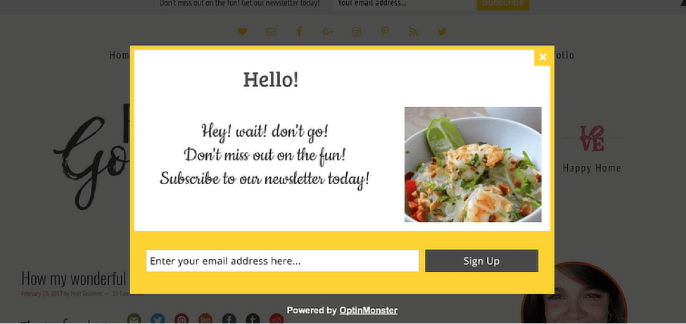
Are pop-ups effective? Some people would argue yes. After all, there are statistics to show that pop-ups drive conversions. So shouldn’t that mean pop-ups work? We’d argue no. Although you might see an uptick in immediate conversions, we believe pop-up ads aren’t an effective user guidance strategy when looking at the customer’s journey as a whole. Meaning, an email address in your list is only valuable if that person feels good about how they arrived there and continues to engage with your brand.
So, moving away from pop-ups, let’s talk about continual engagement. Some marketers have chosen to use videos to get their message across. Not just any video either. Some marketers have used videos that you can’t pause or close to educate a customer on a specific point. Instead of presenting the information up front, the user is sent to the video by way of a clickbait-y headline. To get to the aha moment, the person needs to cringe their way through minutes of other content. Did you get the person’s attention? Sure. But was it an effective way to guide the person to try or buy something? Maybe not. And maybe marketers need to take a page out of the books of user interface (UI) developers to augment how we guide prospects through the sales funnel.
In-App User Guidance Starts to Get a Little Better
As mentioned, user guidance happens before and after a purchase. Some of the biggest advances in guiding users have come from an effort to engage users. App developers have placed a laser focus at this approach to user guidance out of necessity.
When a person downloads an app, it’s imperative that the developer drives user engagement early on. To do this, many developers have taken a similar interruptive approach as marketers have, using pop-ups and visual cues to guide the person through the product. Here are some examples.
In this app, the person shows you how easy it is to invite others into a video call on Google.
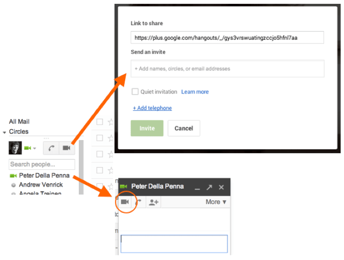
Arrows point to the specific areas you need to look at when trying to start a call, making it clear precisely where you need to go and how you need to get there.
In another example, app developers magnify specific areas to showcase a process or feature. For example, here you can see that the person is using overlays to visually outline the progression a person needs to take to receive and respond to a text message on the iPhone.
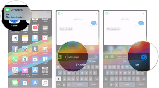
These visual cues guide a person along a journey. But although they’re one step closer to helping people solve a pressing want or need, they’re just not super engaging. The responsibility is still on the user to follow these cues on their own. The approach is decent but still requires a tremendous amount of resources to create this kind of digital walkthrough.
Traditional User Guidance Strategies Won’t Work Anymore
It’s undeniable that digital disruption has impacted businesses across the board. Regardless of size or industry, companies have been forced to fundamentally change the way they engage with customers and employees alike.
Users need guidance; not gimmicks.
In an effort to drive digital user adoption, companies have now realized that consumers need more than a gimmicky approach, like Clippy, or an interruptive pop-up, to feel engaged. In order to demonstrate the benefits of their product, companies need to focus on taking an active approach to engage users through the product, beginning to end. Here’s how.
The New New of User Guidance
Visual cues leave little question in a user’s mind about what the journey is going to look like once they’re plugged in, but they leave out something critical — the story of you and your brand.
As humans, we learn through storytelling. Stories have an undeniable ability to connect with people on a deep, emotional level. When told in a way that’s emotionally charged and compelling, people can’t avoid leaning in to listen. As we learn more about how emotions influence what we buy on a cognitive level, the importance of sharing a story to tug on those emotive triggers becomes crystal clear. Douglas Van Praet hit this point home in his article, The Myth of Marketing: How Research Reaches for the Heart but Only Connects With the Head, when he said,
The most startling truth is we don’t even think our way to logical solutions. We feel our way to reason. Emotions are the substrate, the base layer of neural circuitry underpinning even rational deliberation. Emotions don’t hinder decisions. They constitute the foundation on which they’re made!
Visual cues alone just can’t drive the level of engagement that brands need to cut through the clutter in today’s world. So, in order to spark a deeper connection from the get-go, the new new of user guidance requires brands to pair visual cues with an authentic story/narrative.
Pair Visual Cues With Authentic Narrative
Consider this: Your customer has just reached your page out of frustration. She desperately needs what you have to sell, but she’s not quite ready to pull the trigger on your product or service. Will pop-ups or overlays provide the motivation she needs to purchase? Probably not. But by weaving your narrative into where the customer sits within her journey, you can tell your brand’s story and spark the type of emotional connection needed to motivate her to complete her purchase with you.
User guidance magic happens when you pair an emotive trigger to a visual cue and show users exactly what needs to happen next in their journey. It looks something like this.
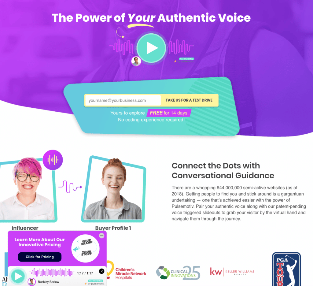
At the precise moment when your buyer is gearing up to hunt for information on your site, your voice triggers a slide out on the page and serves up the next step you want them to take on a silver platter. Within seconds, you’ve eliminated any friction points and instead provided guidance toward the next step in their journey with you. This pairing of voice-led guidance with visual calls-to-action is what’s called conversational guidance.
Separate the Message From the Click for Active Conversational Guidance
From e-commerce to SaaS, every brand can kickstart the conversation and, even better, conversational guidance, with the pairing of visuals and audio. Yet, not every brand gets it right. How you pair visuals and audio matters.
Some brands use video to walk new users through the buying or setup process. These videos are helpful in their own right, but they take a more passive approach to guiding a person to the finish line. Conversational guidance, on the other hand, is active.
When you separate the message from the click, you use two distinct forms of media to push your customer ahead on their journey. It’s like pairing the best possible wine with the best possible cheese. The two different elements taste great on their own, but paired together in separate bites, well that becomes an experience.
The triggered effect of hearing audio and then seeing the visual movement of new information unobtrusively slide out on the screen is actively engaging the user’s senses in that same type of rich experience.
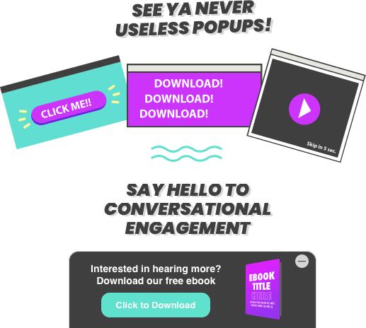
Anyone can click play on YouTube, but that engagement beyond the play button is passive to most. Anyone can click play on a podcast, but again, this is a mostly passive form of engagement. By separating the message from a click-to-engage slide out, you connect the dots in a user’s brain eliciting active engagement on a cognitive basis. The visual movement arrives alongside the narrative at the perfect moment. That’s where the power lies.
Leaders in User Guidance Activate the Experience
What today’s companies need to do is rouse people’s emotions and use that arousal to drive people to act. It’s through the excellent pairing of visuals with authentic storytelling that users are delivered a powerful, rich experience.
Are you ready to try this next level approach to user guidance? The tool is waiting for you here. Sign up for your free trial of Pulsemotiv and test it against your traditional user guidance strategies. The proof of how powerful this approach can be will be waiting for you in the results you achieve.

